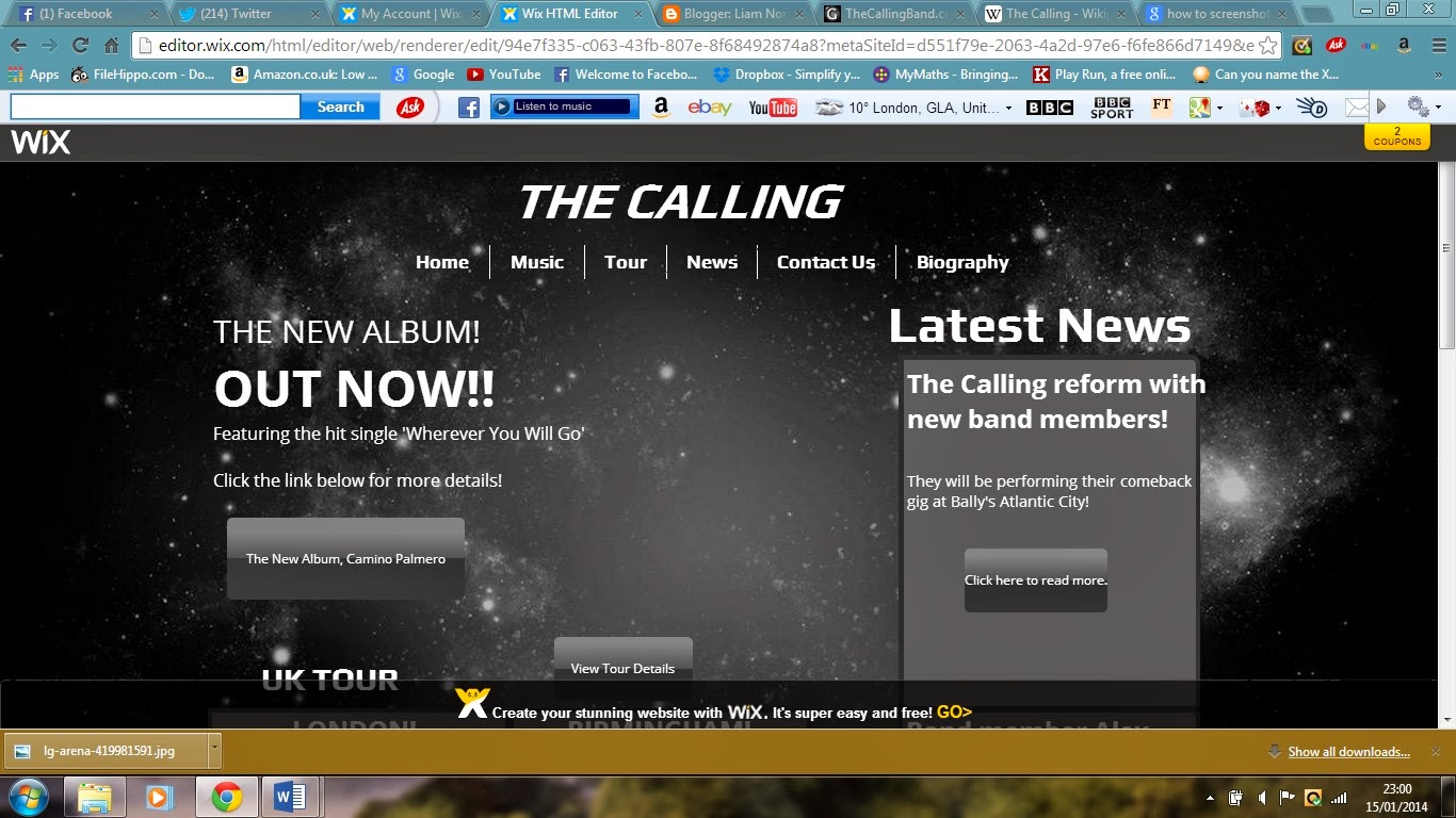
This is the link to my website.
http://liamnorthwood96.wix.com/a2-media-website
Thursday, 30 January 2014
Tuesday, 28 January 2014
Friday, 24 January 2014
Friday, 17 January 2014
Final Digipak Improvements
After I had completed my digipak design, I gathered feedback on it so that I can make improvements to it. This is what my improved version looks like.
Some of my feedback was that some of the text was difficult to read and the RCA Records logo on the CD was too big. Therefore, I changed the style of most of the text but kept the main text on the front cover the same because of it being the first bit of text that will be seen on the digipak. I also made the RCA Records logo a bit smaller so it now doesn't take up most of the CD. Another change I made was that I moved the text of the band and album onto the other part of the digipak spine.
Thursday, 16 January 2014
Wednesday, 15 January 2014
Tuesday, 14 January 2014
Tuesday, 7 January 2014
Subscribe to:
Comments (Atom)


